FMP (Final Major Project)

Posted in FMP (Final Major Project) on January 27, 2009 by shaun85

Main Objective

In order to help the public, particularly the Young; the Poor; and the Vulnerable become more aware of the negative aspects of consumerism, I intend to achieve this by creating an Anti – Consumerism Campaign.


Background Info

Consumerism is the equation of personal happiness with consumption and the purchase of material possessions. Most consumers are potentially exploited without realising it.

Consumerism – protection or promotion of consumer’s interests; high consumption of goods, the belief in this (Oxford Dictionary)

Consumer – one who consumes, especially one who uses a product; a person who buys or uses goods or services (Oxford Dictionary)


Timetable

9th Feb – 13 Weeks – Research

16th Feb – 12 Weeks – Research

23rd Feb – 11 Weeks – Research

2nd March – 10 Weeks – Research

9th March – 9 Weeks – Research

16th March – 8 Weeks – Research and Development

23rd March – 7 Weeks – Development

30th March – 6 Weeks – Development

6th April – 5 Weeks – Development of final idea

13th April – 4 Weeks – Development of final idea

20th April – 3 Weeks – Finalising work

27th April – 2 Weeks – Finalising work

4th May – 1 Week – Finalising work

11th May – Presentation 


Research:

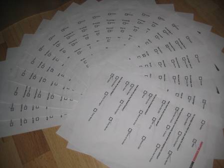
I asked 20 random people from the public to fill out a Questionnaire that was mainly focussing on consumer habits. 

The list of questions that were asked are shown below.


Out of 20 people, 8 females and 12 males filled out the questionnaire.

1)     On average, how often do you shop for clothes? 

 3 people ticked shop every week,  3 ticked shop every 2 weeks, 14 ticked shop every month 

2)    How much do you normally spend when shopping for clothes? 

10 people ticked less than 2 hours, 4 people ticked 2 to 4 hours, 5 people ticked more than 4 hours 

3)    How much do you normally spend? 

2 people ticked less than £50, 12 people ticked £50 to £100, 6 people ticked above £100

4)    Do you buy branded clothes?

2 people ticked all the time, 4 people ticked most of the time, 14 people ticked some of the time, 1 people ticked never 

5)    How often do people buy shoes/trainers?

1 people ticked every week, 1 people ticked every fortnight, 9 people ticked every month, 8 people ticked not often

6)    How often do people buy bags?

0 people ticked every week, 0 people ticked every fortnight, 3 people ticked every month, 17 people ticked not often


img_2651


Anti – Consumerism is not an easy lifestyle to follow, if you’re NEW to the movement.  

My aim is to understand more about being an Anti – consumer.

What I am aware of so far, is the fact that there is a lot of ‘Greed’ within big Corporations. These corporations tend to focus on how much profit they achieve, rather than consider the working conditions within the manufacturing process in factories. 

I also understand that Anti – Consumers believe that there may be a great deal of ‘Manipulation’ that causes people (consumers) to purchase material items and products that they feel are necessary to own. 

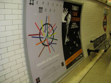
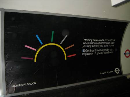
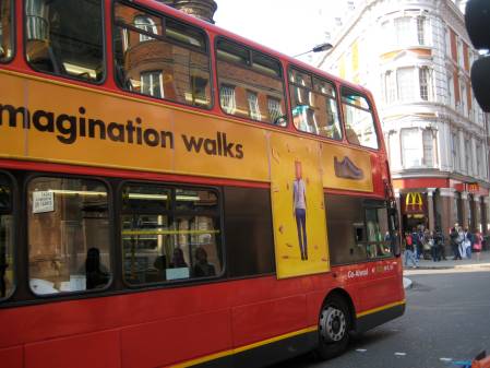
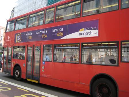
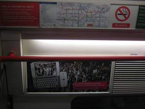
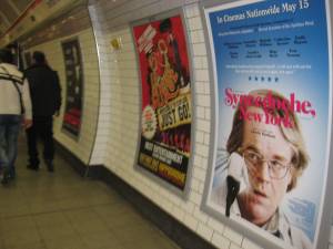
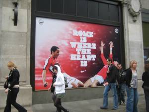
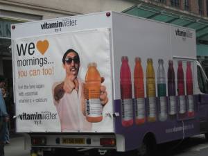
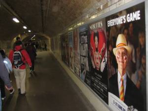
This is caused by the media advertisements that occur today from Billboards on buses; tube stations; trains (public transport); magazines, shop front windows; and most of all from television.


“Why do we always buy what is new? Because Television tells us that we need it.” Adbusters


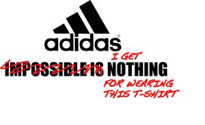
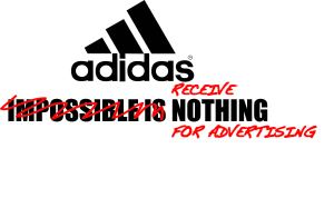
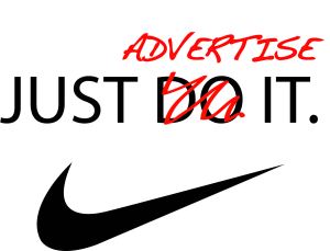
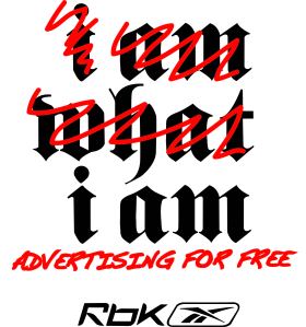
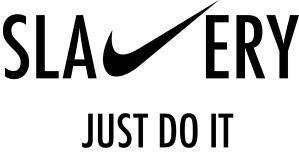
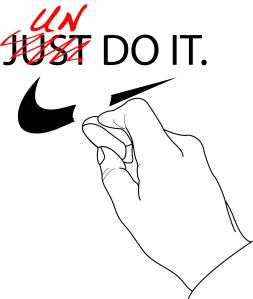
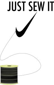
I designed some illustrations that came to mind when thinking about consumerism.

I GET NOTHING FOR WEARING  THIS T-SHIRT

ECEIVE NOTHING FOR ADVERTISING

JUST ADVERTISE IT

I AM ADVERTISING FOR FREE

DON'T BE A COKE ADDICT

SLAVERY_JUST DO IT


UN_DO_IT


JUST SEW IT

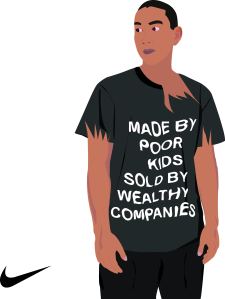
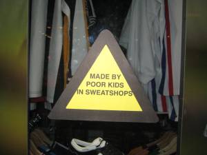
POOR KIDS

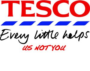
EVERY LITTLE HELPS US NOT YOU

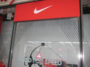
Huge Corporations like the ones above spend millions of pounds in advertising.

The problem

Consumers change their behaviour only when they believe in something. The most ingenious marketing idea on the planet won’t direct consumer behaviour if the values behind the idea or brand aren’t evident or even pronounced every time the consumer comes in contact with that brand. Concepts like ‘message consistent marketing’ and ‘channel marketing management programs’ have recently entered the ever expanding marketing lexicon to address this issue. Some of models introduced go far in coordinating and streamlining message consistency, however the one channel that continues to be the most difficult to communicate values through, is the channel with values of its own: ‘The forgotten channel’ – people.

As soon a consumer begins to believe in a brand, because of something they saw on the television, the net, or received in their mailbox, that brand has more to lose with that consumer than ever before. With every consumer belief, comes a set of consumer expectations around their experience with that brand. When a brand fails to meet one or more of those expectations, it risks consumer resentment and brand dissent. This is made significantly worse when the channel responsible is the brand’s people, as they are the only communication channel that consumers can form a reciprocal and meaningful relationship with. When the human face of a brand lets a consumer down, it all gets very personal. We only need to look at Australia’s financial institutions and our telecoms to see how devastating and irreversible this can be.

The Causes are shown below

Unaware 
The nature of modern marketing focuses heavily on external communication (award winning TVC, results driven DM etc) and because of this, most marketers are either unaware or ill equipped to integrate brand values and behaviour into the people of an organisation. In fact most see that as the job of ‘someone’ in HR. Whilst dominant external marketing plans can work in industries like FMCG, where the brand (or relationship with the customer) involves influencing a customer without any real service element, most industries do have a face to face or interpersonal component that needs to understand and embrace promoted brand values. 

Unqualified
Tertiary marketing qualifications don’t educate potential marketers about the techniques required to instill brand values and subsequent behaviour into a team of employees or client facing staff. By no fault of their own, marketing graduates and seasoned marketers alike have very little idea about what an ‘effective’ internal brand acceptance and brand behaviour program looks like. 

Undervalued
Marketing budgets continue to place the ‘sexy stuff’ first. By this, I mean the conventional channel favorites; anything that a consumer can ‘see, hear or touch’. People development is often either absent or prioritised to the bottom of the resource management list regardless of its ability to be ‘felt’ by a consumer.

Uninspiring
Internal communication programs implemented by the more aware marketing teams often miss the mark. Unlike much marketing activity, the development of human capital doesn’t fit into a ‘campaign’ plan. Team away days and particularly the common conference techniques currently used, serve at best as shallow motivation without scratching the surface of an individual’s value paradigm. 

Uncooperative
If the marketing budget won’t accommodate people development, other department budgets may. However the conditioned understanding of the roles and responsibilities of the Sales and Human Resources function again rarely takes responsibility for brand specific people development. Further, HR departments universally are renowned for not understanding nor wanting to understand current business issues, and this includes brand imperatives. 

The Solution
Achieving brand and message potency through consistency requires a great deal of collaborative effort and understanding. With regard to the brand’s ‘forgotten channel’ – its people, marketers may also be required to manage their egos and question their attachment to their more overt executions, or ‘the new ad campaign’ that is due next month. The solution to brand consistency is bigger than most marketers think and will call on skills and resources that most marketing teams are unlikely to possess. 


Here are just a few locations of where people may come across advertisement billboards.


tube1


Tube2


tube3


tube4


img_2555


public transport


img_2668


img_2671

img_2678

img_2734

img_2735


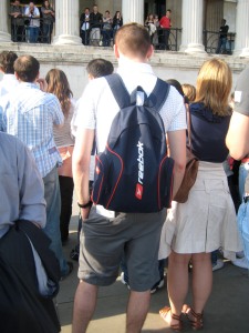
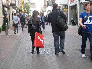
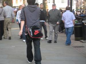
Here I took photographs of random members of the public advertising for free.

img_25751

adidas

free advert2

img_2572

free advert1


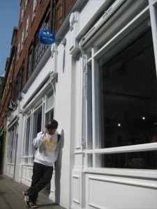
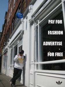
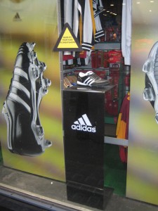
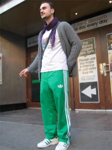
I photographed a friend at front of an Adidas Retail Store in order to show an obvious example of Free Advertisement.

 adidas4

adidas_leaf1


IT’S A commonly held belief that we could go a long way to ending world hunger, poverty and pollution if Americans would stop consuming so much. BRIAN JONES explains why this is wrong–and why it lets the real culprits off the hook.

“THE WEALTH of those societies in which the capitalist mode of production prevails,” wrote Karl Marx in the opening of his famous study of capitalism, Capital, “presents itself as an immense accumulation of commodities.” A century and a half later, the “immense accumulation of commodities” is nowhere greater than in the U.S.

Many people fighting for a better world recognize that the methods of capitalist production are rapidly destroying the environment, and that U.S. imperialism has created poverty and misery in the Third World. But many people also ask whether the American consumer is also to blame.

The Detroit Project, for example, organized by left-wing gadfly Arianna Huffington, sponsored television commercials that blamed SUV drivers for the destruction of the ozone layer and the war on Iraq. In reality, however, stopping people from buying SUVs will solve neither problem.

First of all, U.S. citizens don’t rely heavily on Middle Eastern oil–our oil comes from other parts of the world. The U.S. ruling class isn’t interested in using Iraq’s oil, but in controlling and selling it to the rest of the world. Control of the world’s second-largest oil reserves would be a top priority for them, even if there weren’t a single car on the road in America.

Nevertheless, it’s true that carbon dioxide emissions from cars are destroying the earth’s ozone layer. But banning SUVs still leaves almost 200 million carbon dioxide-emitting automobiles on the road, not to mention the emissions of countless factories in countless industries. A real solution to the emissions problem therefore would have to involve, at the very least, not only a reorganization of factories that pollute but also a revamping of our whole mode of transportation.

IF THE goal is to the save the environment–to actually save it, and not justfeel like we’re saving it–one’s individual choice of car is virtually irrelevant. As consumers, we don’t get to choose whether or not there will be public transportation, for example. We are only given a choice among vehicles that will make a profit for the auto companies. Blaming the destruction of the environment on those who drive SUVs lets the real organizers of pollution–the auto companies–off the hook.

The real obstacle to protecting the environment is not the appetite of consumers, but the appetite of a system that’s driven by competition for profit. SUV sales account for about 90 percent of the profits of the Big Three automobile manufacturers.

The fact is that for most people, cars are no longer a luxury but a necessity. Changing the organization of our lives so that we no longer require gas-powered cars directly conflicts with the interests of the largest corporations in the U.S. The first, third and seventh corporations on Fortune’s 500 list are automobile producers. Three more of the Top 10 are oil companies. Altogether, 22 of the top 50 rely on automobiles for their business.

Can we, as consumers, seriously challenge these companies? If we organized 3,000 car-buyers to not buy cars, the automobile-industrial complex would probably not even notice. But in 1996, just 3,200 autoworkers struck General Motors in only two Ohio plants and, as a result, GM’s entire North American operation was crippled.

We have much more power as workers than we have as consumers. Focusing on stopping people from buying SUVs, at best, means we’re pursuing a weak strategy for change. At worst, it leads to blaming the wrong people–the consumers–for the problem.


THE BELIEF that we, as individuals, are to blame for society’s problems also persists in the way many people think about world hunger. Many believe that people around the world are starving at least in part because Americans are overeating.

First, this argument ignores the fact that plenty of Americans aren’t getting enough food. Some 13.6 million U.S. children under the age of 12 are chronically hungry or at risk for going hungry. That’s one out of every three children under the age of 12.

But for those of us who are relatively well-fed, the question still stands: Do people around the world starve because our French fries are super-sized?

There might be a grain of truth to that if it were the case that there wasn’t enough food in the world for everyone to eat. But that’s not the case at all. World food production at its current level could provide every single man, woman and child with 3,500 calories a day, or roughly 4.3 pounds of food–in other words, enough to make everyone fat.

Under capitalism, the “shortage” of food is artificial. So, in sub-Saharan Africa, some 213 million people are chronically malnourished. Yet year after year, sub-Saharan Africa is a net exporter of food.

In a capitalist economy, food isn’t produced to feed people, but to sell for profit. There’s no profit to be made from feeding poor people. That’s why so many people are hungry–there’s plenty of food, they’re just too poor to buy it. What we really need is a socialized, rational production of food for the purpose of feeding people.


THE CAPITALIST system has convinced us that we need all of kinds of products that we don’t actually need–such as DVD players and the latest style of shoe. Therefore, the argument goes, refusing to buy these products not only decreases the power of the corporations that produce them but also frees our minds from the “capitalist mentality.” 

It’s easy to see where this idea comes from. In 1992, U.S. corporations spent $1 trillion on advertising, $600 billion more than was spent on education. This enormous sales effort does affect our mentality, but it’s not the root of the problem.

Marx wrote 160 years ago about what he called “alienation.” He argued that even though all of the products of the world–the “immense accumulation of commodities”–are produced by us, they seem to be separate from us. Workers make them, but they don’t own or control them. As Marx said, “that life which he has bestowed on the object confronts [the worker] as hostile and alien.” In fact, it appears as if the products own us, as though they control us!

So it’s a natural reaction to think that we can be free from the system by rejecting its products. But this reaction is actually the flip side of the same coin. The person who must have the latest fashion and the person who must not have it actually have the same fetish.

The mistake is to see the commodity itself as having too much power. It’s true that shopping will never make us as happy and free as commercials would like us to believe. It’s also true that not shopping won’t emancipate us either. Neither approach actually creates much change.

So even though some people may think that it’s radical not to buy name-brand products, as long as they want to remain alive, they have to get food, water, clothing and so on somehow. In other words, one way or another, they will rely on the production of the things that they need.

This said, there is a tiny group of people at the top of society who doconsume too much–the ruling class. While we produce all of the wealth of the world, they grow richer as they demand that we make do with less. If we really want to make sure that all of the world’s people are provided for, the key is fighting for a totally different society where the priority is providing for the needs of the majority, not the profits of the few–a socialist society.


Consuming too much can lead us into debt.

This maybe caused by the fact that we are manipulated by advertisements that tell us we actually need the product.

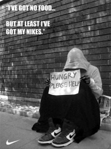
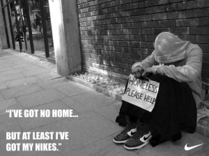
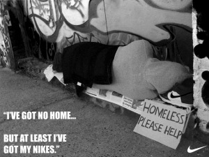
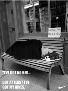
I photographed my friend in Bricklane and portrayed him as a homeless person with his Nike trainers beside him.

My aim was to send a message to the audience to let them know that no matter how much you spend on material items and continue buying into brands, you really have nothing because they are just meaning less things.

You pay money to fulfill your sub-conscious minds but in reality money doesn’t buy happiness.

On each photograph I aimed to send a message to allow the audience to connect the text with each image.


hungry1

no_home1

no_home21

no_bed2


Impulse buying

Consumers tend to fall into the trap of ‘Impulse’ purchasing.

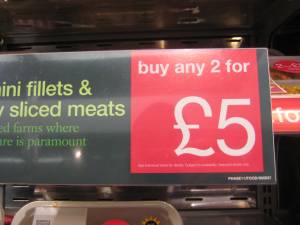
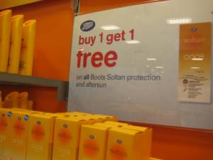
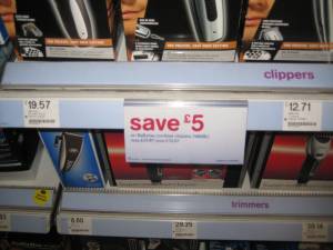
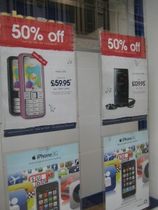
Impulse purchasing is when a consumer buys things that they would not normally be looking for in the first place but ends up buying it anyway. This may happen because an item maybe in special offer for example, buy one get one half price.

Impulse buying happens when you get caught up in the hype of a situation and you buy something without thinking much about it. Impulse items may be new products, samples or well-established products at unexpected low prices.

Situations that play on shoppers impulsiveness include: items on sale tables that advertise ‘huge bargains’ or ‘10% off all items’ or the enticement of announcements that something is half price for the next 5 minutes. Impulse buying makes you spend money on items you may not really need or want. To avoid impulse buying you need to ask yourself if you really need the item or just want it.


Can you stop impulse buying?

One of the ways to becoming more frugal is to stop impulse buying. It’s so easy to convince yourself that the item you’re about to buy is a really good deal. But the real question is, do you really need it? The post I wrote Saturday was about a few good deals I got on a few Christmas items. Did I need those items, no but I will use them come Christmas time and I am avoiding paying full price come next Christmas. The difference is I didn’t purchase more than I would need nor will it sit in a closet and never be used.

There’s a difference between impulse buying and buying things you need. If you have 20 pairs of jeans in your closet and jeans are on sale right now, do you really need another pair of jeans? Probably not but you just can’t pass up a good deal. That’s when you need to learn to tell yourself no and re-think your spending habits.

Just say no. It may not be easy to do but once you start telling yourself no, you will feel confident in controlling what you need and what you buy just because you want it.


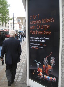
Don’t fall for these advertisements – Here are some examples


img_2704

img_2709

img_2710

img_2712

2for1

50Consumer’s sub-conscious mind

Consumers may associate themselves with other people into thinking they need a particular item because the person next to them has got it. It’s on the consumer’s sub-conscious mind that allows them to feel the need to have something so they don’t feel left out if the person next to them owns something that they don’t have.

Consumers also tend  to associate themselves with celebrities, which may also be known as an ‘Idol’ to them.

It doesn’t help when companies such as Nike sponsor famous football teams such as Manchester United. This manipulates the consumer into thinking the football kit is worth buying due to famous footballers wearing the same the thing.


Wayne Rooney is a good example.

wayne_rooney

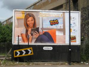
Beyonce in this advertisement is also a good example of why people may want to purchase the product being advertised. Her being a talented singer but most of all a celebrity is the reason why people in the public may want to invest in the product.

 IMG_2952  

Be happy without material things

By learning to be happy with less, you just may find that so many possessions were merely complicating your life.  You may find that few—but more special or unique—things trump multitudes of mediocre or common things.  True, some material objects do make our lives easier, but they cannot bring us happiness, which must be found within.

“We must rapidly begin the shift from a thing-oriented society to a person-oriented society.  When machines and computers, profit motives and property rights are considered more important than people, the giant triplets of racism, militarism and economic exploitation are incapable of being conquered.  A nation can flounder as readily in the face of moral and spiritual bankruptcy as it can through financial bankruptcy.”

Dr. Martin Luther King, April, 1967


An example of somebody being crushed by debt

Two days ago at 3 am, my husband and I were awoken by the repo man coming to get our vehicle. I have so much credit card debt that I will probably file bankruptcy. I am so sick of our society and having to have “things.”

Sure it’s nice to have a vehicle that is nice and new, but at what cost? When I come to the end of my life, am I really going to care about all of the crap that I possessed? I want to lead a simple life. I want to drive a piece of crap car because it will be paid for and no one can come knocking on my door and take it from me!

I try to lead a simple life. I don’t shop very much etc. But, somehow I eventually get wrapped back up in all the consumerism. I guess it’s because, if you are born in a rich country, it is shoved down your throat 24/7 all your life. It is a hard habit to break.

We all want everything now. Our society is focused on immediate gratification. We wouldn’t want to save money and then pay cash for what we need! Oh no! Why do that when you can get instant credit. Then we can have what we want NOW.

I have almost 23,000 worth of credit card debt and I couldn’t tell you what I bought. Isn’t that sick?

America has a health care crisis. People can’t afford to go to the doctor when they get cancer from all the pesticides and antibiotics that our government puts in our food. But, we never hear about that do we? How about the pesticides that coffee growers use that are banned in the U.S.? But, it’s okay to import beans from countries where it isn’t banned.

I wish I could disappear from this society. I don’t want anymore “instant credit” or pre-approved card offers. My mind and life are filled with ‘how are we going to pay this or that.” I can’t answer the phone. God forbid it’s a bill collector. Why do we do this to ourselves?

If a kid is lucky enough to have both his parents under one roof, he never sees them. Both parents work their asses off. Why? so we can buy more things. Then we wonder why the divorce rate is so high and the kids are killing each other.

I could go on and on. I think it’s time to do some real soul searching. Thanks for letting me ramble on.


“People say if we stop buying so many things, the economy will collapse.  I say, we are buying the wrong things.  If we buy high-quality, sustainably made goods—even if we buy many fewer of them—the economy will be stronger and more stable than ever.  Let’s face the facts, an economy based on the increasing consumption of resources is only temporary, because the amount of resources on the planet, without a doubt, is finite.  Once the Earth is all used up, we don’t simply move to the next valley.”

Rob Horowitz, anti-consumer advocate


Our desires are polluting the entire world, not just our own country.  American companies extract resources and dump toxins everywhere, just so we can be clean and comfortable.   If the developing world mimics our consumption patterns, the planet will be completely fouled and resource bankrupt soon enough.  Furthermore, we have no credibility to ask developing nations to forego luxuries until we show restraint ourselves.  Then, and only then, can rich nations educate developing nations to build sustainable societies and bypass our wasteful extravagances. 

Specific types of goods for  which we must immediately reduce demand:

– all mined or extracted products, especially petroleum and heavy metals

– disposable products

– chemical fertilizers and pesticides

– internal combustion engines 

– virgin wood products 

– anything made with exploited labor

– products which cause disproportionately large or toxic pollution


Do we consume too much?

To some, the answer is self-evident. If there is only so much food, timber, petroleum, and other material to go around, the more we consume, the less must be available for others. The global economy cannot grow indefinitely on a finite planet. As populations increase and economies expand, natural resources must be depleted; prices will rise, and humanity — especially the poor and future generations at all income levels — will suffer as a result.

Other reasons to suppose we consume too much are less often stated though also widely believed. Of these the simplest — a lesson we learn from our parents and from literature since the Old Testament — may be the best:although we must satisfy basic needs, a good life is not one devoted to amassing material possessions; what we own comes to own us, keeping us from fulfilling commitments that give meaning to life, such as those to family, friends, and faith. The appreciation of nature also deepens our lives. As we consume more, however, we are more likely to transform the natural world, so that less of it will remain for us to appreciate.


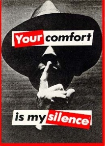
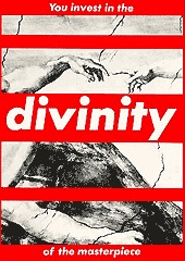
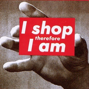
Inspiration from Barbara Kruger.

Barbara Kruger (born 1945) is an American conceptual artist represented by Spruth Magers Berlin London.

Kruger’s graphic work consists of black and white photographs with overlaid captions set in white-on-red Futura Bold Oblique. The phrases included in her work are usually declarative, and make common use of such pronouns as “you”, “I”, “we”, and “they”. The juxtaposition of Kruger’s imagery with text containing criticism of sexism and the circulation of power within cultures is a recurring motif in the work.

In The text in her work of the 1980s includes such phrases as “Your comfort is my silence” (1981), “you invest in the divinity of the masterpiece” (1982), and “I shop therefore I am” (1987). She has said that “I work with pictures and words because they have the ability to determine who we are and who we aren’t.” 


your comfort

you invest

i shop

Creating an awareness to the public

In most countries, people understand a warning sign is normally a shape of an equilateral triangle with a white background and a thick red border.

Majority of people in the world understand that triangles displayed on public locations tend to signify a warning/hazard.

Here are some examples 

img_2760

img_2761

img_2762

img_2763

img_2766


These signs were made from aluminium and I was interested to find out about the process of actually producing these signs.

I sent an email to ask if a printing company can assist me with as much information on how the process is carried out.


email_rob


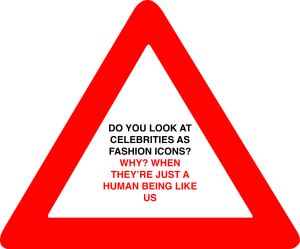
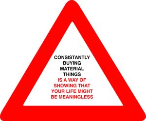
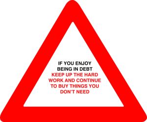
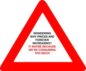
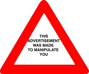
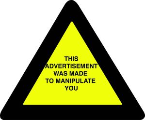
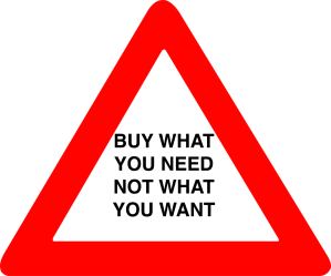
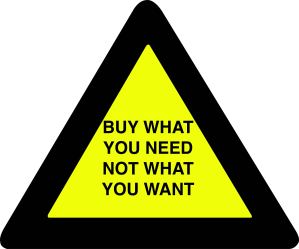
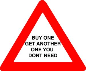
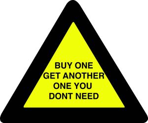
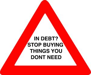
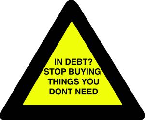
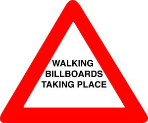
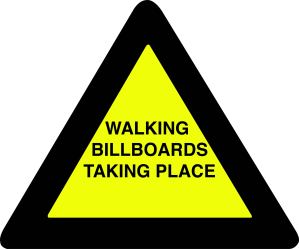
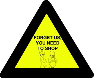
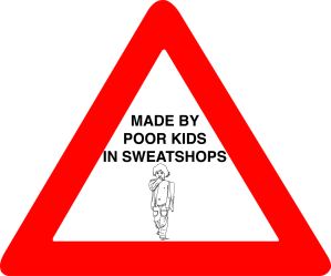
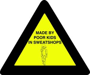
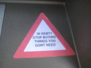
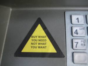
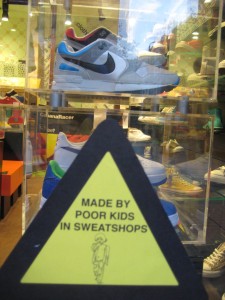
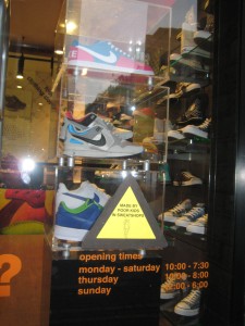
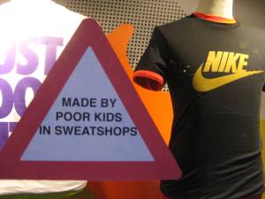
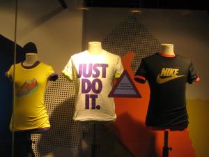
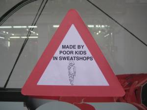
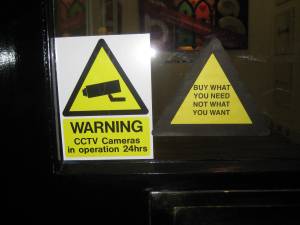
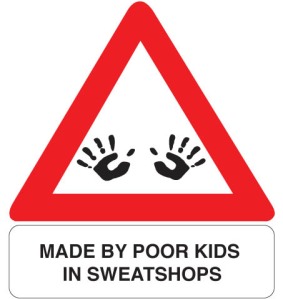
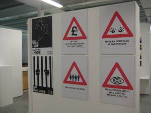
Using the concept of a warning triangle as a form of awareness, I placed messages inside the red border of the triangle.


My aim is to create a reaction from the public and allow them to understand the message behind each triangle.


warning_triangle4

warning_triangle3

warning_triangle2

warning_triangle1


After completing these triangle designs, I felt that the messages inside were too long.


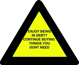
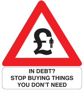
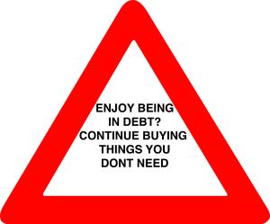
I shortened the message ‘If you enjoy being in debt? Keep up the hard work and continue to buy things you don’t need’ because in reality, one of the main causes for people ending up in debt, is due to consumption of material things.


The message now reads ‘Enjoy being in debt? Continue buying things you don’t need’ and I also produced more triangles with related messages that I thought were important for the public to see.

The text has been changed to one colour in order for it to look straight forward and easy to understand. 

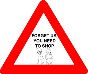
From my research, warning triangles are either black and yellow or red and white. I used these same colours for the triangles below.16
15

13

14

11

12

10

9


6

5

2

1


Below are some illustrations of poor kids that I felt relate to the actual messages portrayed in the triangles.8
7


4

3


Below shows photographs of a few locations where I displayed some of the messages.

IMG_2861

IMG_2863

IMG_2864


IMG_2941

IMG_2931

IMG_2925

IMG_2922

IMG_2934

IMG_2933

IMG_2909

IMG_2910

IMG_2911

IMG_2912

IMG_2926

IMG_2927

IMG_2921

IMG_2935

IMG_2936

After carrying out these messages within the triangles, I thought it would be a good idea to design symbols that would relate to a message.

We are bombarded by signs everywhere we go.

A good example of these signs is a Road Work Sign.

roadwork_sign

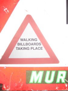
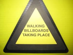
I designed symbols for four different messages, which are shown below.

child labour

in debt

manipulate

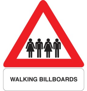
walking billboards

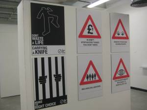
Final Exhibition
IMG_2989

IMG_2990


Youtube Advert

Posted in Youtube Advert on November 9, 2008 by shaun85


What is Beauty? is a question that everyone may want the answer to. However, as an individual, my interpretation of Beauty could be totally different to the person sitting next to me.

This advert based on Norwegian Airlines really attract my attention. It helped me realise that beauty cosmetic advertisements encourage the audience to think that they have a good chance of looking just like the person in the advert. 

Norwegian Airlines Ad – Beauty is only Skin Deep

I agree on the quote below as it points out that people in adverts are portrayed as beautiful people. This causes the audience to focus on what they could look in comparison to what they already do.

‘The notion of beauty affects almost every experience we have. One has only to look at how the marketing profession uses various elements of beauty to sell every product from haute couture to breakfast cereals. That’s because marketers know that we are all innately drawn to beauty; so they use beautiful people and props to draw us toward their products. They know that beauty resonates so deeply with the human heart that it has inspired some of the greatest human creations, including the arts. And, yet, when we ask what is beauty, we generally find it difficult to give a succinct answer. It’s easier to say what it isn’t.’ Dr. Pia de- Solenni

I find this video funny because it has no meaning behind it what so ever. The audience are forced to watch a beautiful female model hold a burger for a few seconds without even eating it, which I find hilarious. I had to post this up.


How I wanted to approach beauty, is by pointing out that the important aspect of it comes from the inside and not the outside. People today, worry to much about how they look on the outside and continue having a bad judgmental attitude towards others. As individuals, we all dislike the feeling of pain within and do our very best to avoid it happening to us. But it doesn’t help when people don’t have the decency to respect other peoples feelings. Making somebody feel ugly on the outside is very easy to do because there are so many people that will choose their friends (who they hang around with) and not want to befriend a particular person or give somebody a ‘dirty look’ to show some sort of arrogance or even avoid a person due to their skin colour etc. The fact that i am looking at beauty within ourselves, I managed to find a video on youtube that caught my attention. This video is based on racism and why people shouldn’t judge people by their skin complexion because it makes them look ugly. I felt that after watching this short clip, that the moral behind the advert is very powerful that it should encourage people to stick up for anti-racism and reject racism.


The fact that people tend to judge a book by its cover and look at what is on the outside without giving another individual a chance to get to know their personality.

You can argue that an arrogant person may find somebody to relate to and be happy with that person but on the other hand, that same arrogant person may find that if they don’t change, they will end up alone and sad. 

For my stop motion advert based on beauty, I focussed on why people judge others for the way they look. My aim was to make the audience aware that as human individuals, we are all similar because we do the same things such as eat; drink; smile; sleep etc.

Hopefully, the audience watching my advert will be able to see passed peoples looks and acknowledge the similarities we have as a human race and unite with one another because we are all alike. 

1st Draft

After watching my animation over and over again and also receiving feedback from the audience, I had come to the conclusion that it doesn’t send the message that I wanted to be put across in the first place.

Instead, it just shows myself in a stop motion clip, acting out how people may eat; drink; smile; and eat without putting a message across, that is based on beauty.


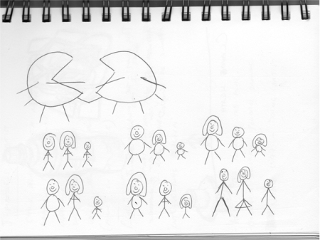
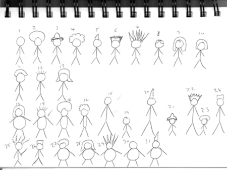
A few simple illustrations I had drawn in my sketch book are shown below.

These drawings were suppose to represent a range of different characters in order to concentrate on the term Its normal to be different.

My aim was to  point out to the viewer that everybody in the world has different appearances and that the person next to you will not look the same as you.

ideas_1

ideas_2

This is a re-creation of my beauty advert. My previous advert pointed out that we all smile, eat, drink and sleep.

After producing my previous advert, I felt as though the visual aspect of the idea did not really send a powerful message across to the audience.

The fact that we are all different, emphasises individuality and this may be the cause of discrimination.

From my previous advert, the fact that it points out that we all do the same things in life does not answer the brief itself.

The main focus of the brief is based on ‘Beauty’ and not ‘what we can do’ in life. This is the reason why I done a completely different advert and focussed on the different appearances we may come across. I done this using fine liner on tracing paper. I used tracing paper because I traced each character and added another person each time in order to create a sequence of different people.

Below is what I have come up with so far. 


I wasn’t totally happy with my previous attempt of my animation based on beauty.

This is because I felt as though the text transitioning from every direction and as well as myself acting out each step of eating, drinking, sleeping and smiling was not effective enough for the audience to understand.

The message trying to be sent across to the audience wasn’t as clear as i hoped it would have been. For this reason, I decided to create another animation that would hopefully send a clear message, which states ‘Its normal to be different, Its wrong to treat people differently’.

With this I also accomplished a range of simple illustrations of different people and used colouring felt tips and three sheets of card paper.

I took photographs of each step in order to put my sequence of photos together onto onetruemedia.com and add my own music that I had composed myself.

Final Advert – Beauty Campaign

Personal Project

Posted in Personal Project on November 4, 2008 by shaun85

Brief

Re-create ‘The Newham Magazine’. Make it look more presentable and well structured in order to attract a wider audience. Focus on the layout and typography for the magazine.  

Proposition

The Newham Magazine contains a great deal of information and activities that the community can take part in. This magazine is a source that the community relies on and spends most of their time reading.


Target audience 

15-40 year olds (50% male, 50% female) who have time in their hands to sit down and acknowledge the different activities and information that is mentioned in the community. 

Considerations

Things to take into account


  • Advice and Benefits
  • Business and Regeneration 
  • Community and Living
  • Council and Democracy
  • Your Councillors
  • Education and Learning
  • Environment and Planning
  • Health and Social Care
  • Housing
  • Jobs and Careers
  • Leisure and Culture
  • Transport and Street


Reasons for re-creating the Newham Mag

Inconsistent use of typography.

No sign of columns and a structured layout.

To make the magazine look clearer for the reader to navigate themselves around the magazine.


Solutions to these problems

·      Stick to ONE typeface

·      For each paragraph, stick to one size. Also for headings and sub-headings, keep the size consistent.

·      Make sure each picture/photograph is placed within the columns. Depending on how important the picture/photograph is may vary in size but keep it to a minimum.

·      Categorise each and every topic in order for it to be easy forward to find. For example, for Business information, the colour of the page can be green which tends to represent ‘GO’. For News information, the colour can be red which normally represents ‘STOP’. Most information gathered from the news are normally negative, therefore the colour red may be a good representation of it.

·      Makes sure the text are set out in columns and well structured. This will make it easier for the reader to understand and follow the content on each page. Also look at broadsheet newspapers and focus on the consistency of the layout on each page.

·      Stick to a limited colour palette in order to keep a clean consistent look.

·      For example, have the topic colour, black text and picture/photograph box. Ignore trying to put colourful borders and different colour text as this will make the page look very busy and the reader will be confused in what to look at first.


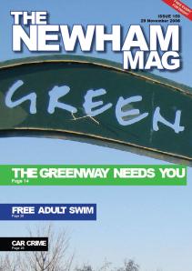
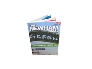
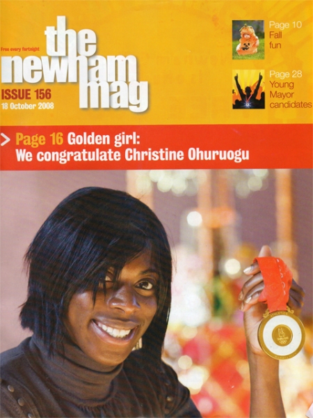
Front Page of The Newham Magazine Issue 156 October Edition

This the front cover of the Newham Mag which is October issue. My intentions are to re create this front cover and give it a new identity.

newham_front


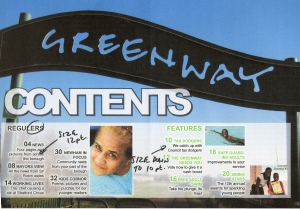
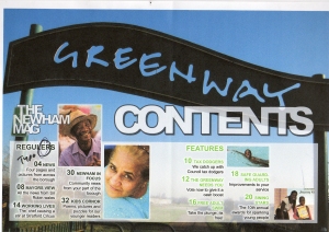
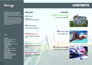
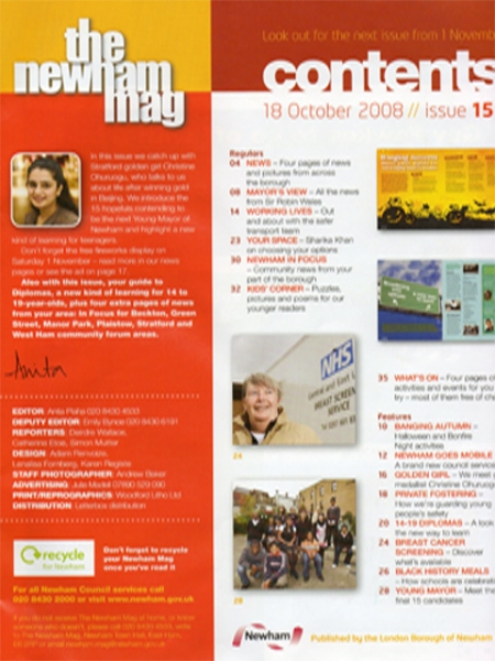
Contents Page

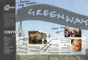
This is the contents page for the Newham Mag, October issue. Creating a new layout for this page is what I aim to do.

contents_page


RESEARCH

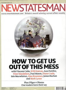
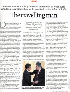
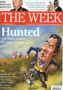
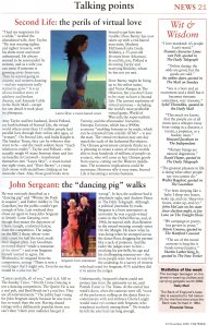
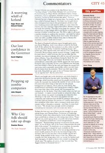
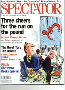
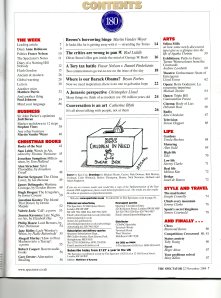
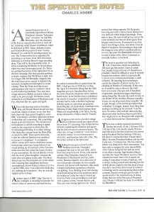
I started looking at business magazines as an approach for looking at a variety of layouts with magazines. These magazines were Spectator Magazine; Newstatesman Magazine; and The Week Magazine. 


Spectator Magazine 

Consistent 3 Column Page Layouts; Headings consist of a Sans – Serif Typeface; Main body text consists of a Serif Typeface; Imagery consistently situated in the middle column of every page layout; Categories are in a different color compared to the min body text

Spectator Front CoverSpectator Contents Page

Spectator 3 Column LayoutSpectator 3 Column Layout


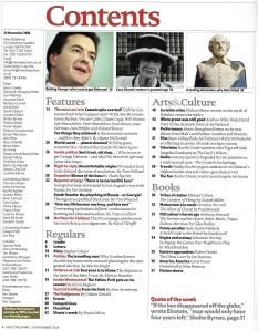
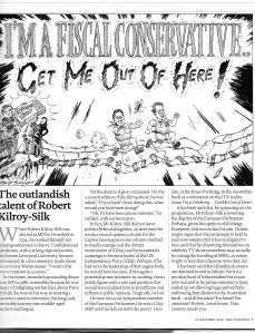
Newstatesman Magazine

Consistent 3 column page layouts; Headings and main body text consists of a Serif – typeface; Topic and Categories consists of a Sans – Serif Typeface. 

Newstatesman Front CoverNewstatesman Contents Page

Newstatesman Page LayoutNewstatesman Page Layout


The Week Magazine 

 No Contents Page; Inconsistent page layouts; consistent use of typography (Serif typeface) for both headings and main body text

The Week Front CoverThe Week Page Layout

The Week Page Layout


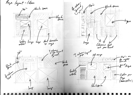
Experimenting with layouts

After looking at the Magazines above, I decided to accomplish a few layouts of my own. These double page spreads contain information from the Newham Magazine Website.

Below shows examples of 3 and 2 column page layouts.

I randomly chose the color green to represent the News Category.

Here I produced a 3 column double page spread which contains the page category; sub-headings; main body text; imagery; color scheme; and page numbers.

3 Column Double Page-Spread


From the previous layout above, I transformed this layout into a 2 column double page spread which also contains all the same elements as the layout above. The reason for this 2 column layout was because I felt that the less columns there were on a page , the less busy it will look.

2 Column Double Page Spread


Here I decided to increase the size of the sub-headings in order to emphasise the importance of it. I also changed the color strip to make it look more eye catching to the viewer.

2 Column Double Page spread

Feedback I had received from my tutorial group

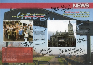
Page looks very busy; Extremely type heavy (too much to read); and Boring to look at.


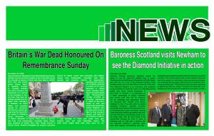
After receiving this feedback. I then produced a few more double page spreads and used a color scheme to represent each topic. My main intention was to create an eye-catching but simple outcome for these page spreads.

These layouts are shown below.

News

news


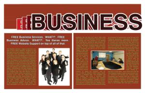
Business

Business


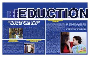
Education

Education


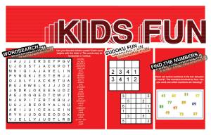
Kids-Fun

Kids-Fun

For each page, the information was taken from the actual Newham magazine website. 

Feedback I had received from my tutorial group – Boring; Not much has changed in comparison to the Original Newham Mag; Doesn’t look like a magazine spread – looks more like a series of web-pages; Also looks amateurish and untidy. 


Further research based on magazine layouts

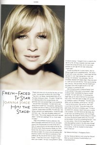
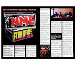
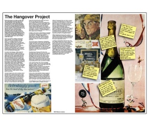
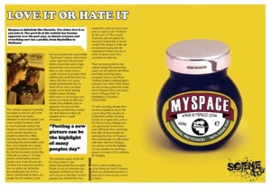
Below are a few layouts, I had looked at in order to gain more of an understanding with page – layouts. I looked at 2 and 3 column spreads and focussed in the way imagery was laid out on a spread. These examples below belong to magazines such as Dazed; Pulp;  and Scene.


3 column layout

Pulp-Mag

Pulp_Mag

Scene_mag


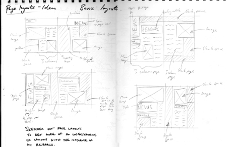
Sketch Ideas for my Magazine Layouts

sketch1

sketch2

sketch3


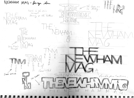
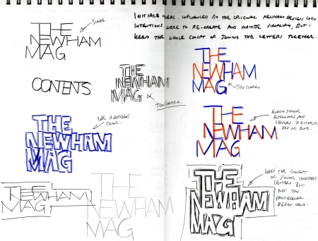
Re-designing the Newham Mag Title 

Below are simple re-creations of the Newham Mag Title.

I decided to stick with the same concept as the original title by joining the letters together.

Design ideas

Design ideas2


Choosing a Typeface for the Newham Mag

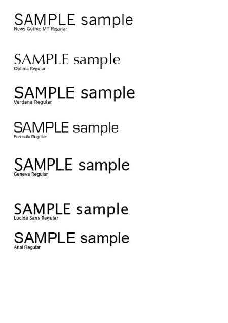
Here  I selected a few choices of sans-serif typefaces to represent as the main font for my Newham Magazine.

Sans-Serif typefaces were chosen instead of Serif typefaces.

The simplicity of not having a serif attached to the lettering may be suitable for the selected market the Newham Mag is aimed at.

Below show examples of my selection.

These typefaces include – News Gothic MT; Optima; Verdana; Eurostile; Geneva; Lucida Sans; and Arial.

Samplefonts


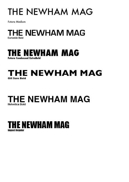
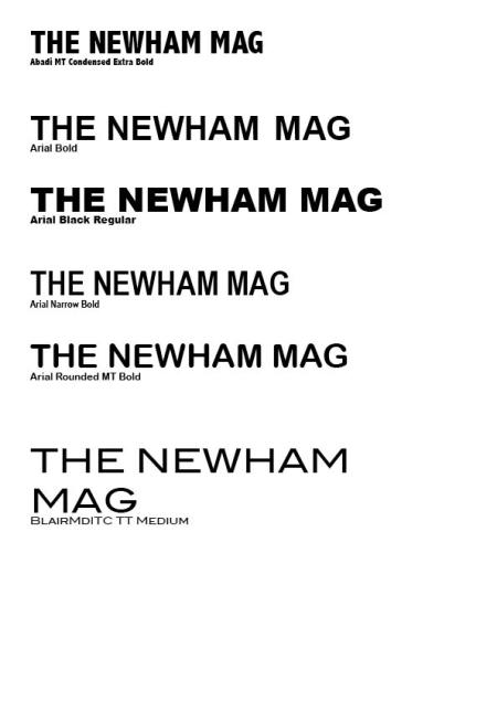
Selection of Front Cover Typefaces

Below show examples of selected typefaces that may be useful fro the front cover of the Newham Magazine.

These examples include – Helvetica Bold; Impact Regular; Gill Sans Bold; Futura Bold; Eurostile Bold; Abadi Condensed; Arial Bold; Arial Black; Arial Narrow Bold; Arial Rounded Bold; and BlairMditc TT.

frontcover_fonts

frontcover_fonts1


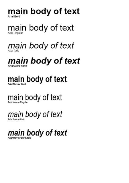
Arial Typeface – as main text for The Newham Magazine

Arial typeface was chosen because there are a variety of choices to choose from in comparison to the other typefaces that were selected.

This typeface consists of various choices such as Arial Bold; Regular; Italic; Bold Italic; Narrow Bold; Narrow Regular; Narrow Italic; and Narrow Bold Italic.

maintext


Front Cover Title Design

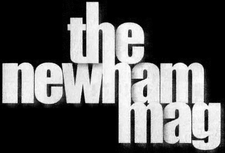
Below shows the original design for the Newham Mag Title.

original newham mag title


Re-Designing the Newham Mag Title.

Arial Black is the typeface I had used in order to re-design the Newham Mag Title. 

I completed this task on Adobe Illustrator to join up each letter and then blanked out the overlapped lines to create this ‘joint up effect’. 

My aim was to keep it reasonably bold and simple to read.

Below shows my final outcome.

my design


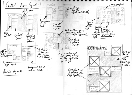
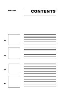
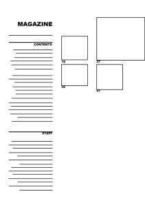
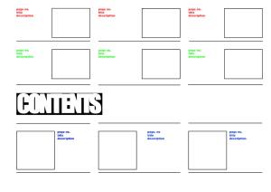
Ideas of Contents Page layouts

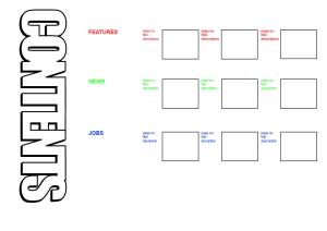
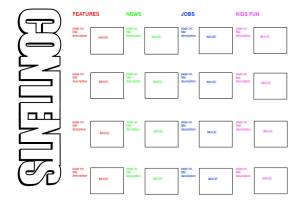
These templates involve Color-Coding for the different sections and also a few simple structured layouts for the contents.

My aim was to stick to a simple approach in order for the viewer to find it easy to navigate themselves around the page.

The main focus was to prevent the layout from looking too busy and untidy to read.

Below show examples of my ideas for the contents page.

content_idea1

content_idea2

content_idea2

content_idea3

content_idea4


Reflecting from my content layout ideas above, below are stages I had gone through in order to be satisfied with the final outcome of my contents-page layout.

This is because I came across problems which involved the scale of text used; the structure of the layout; type errors occurred; and where to place the imagery was a bit of a concern.


Stage 1

content idea


Stage 2

content


Stage 3

content ideas


Stage 4

content idea


Stage 5

content ideas


After designing the contents page, I went onto designing a layout for the news page-spread.

Below shows the stages of development I went through in order decide on a final layout.


Stage 1

spread1


Stage 2

spread2


Stage 3

spread3


Stage 4

spread4


Stage 5

spread5


Stage 6

blog_spread6


Stage 7

spread7


Feedback Received: 

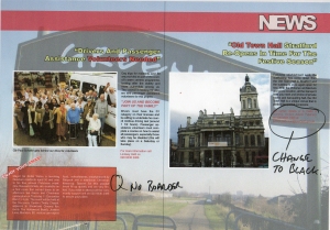
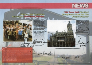
The audience pointed out that it doesn’t look like a magazine spread, looks more like a web-page.

Also mentioned that columns are not obvious, looks as though the images and text were placed anywhere.

They also struggled to find the centre point margin on the spread to show its a magazine. 

The audience wanted to see a finishing magazine outcome to get the feel that it was a magazine project I was taking on.


Evaluation after the exhibition and feedback:

I decided to go back to my news spread and contents page to improve the layout.

I felt that the colorful boxes did not go well with the text and may have caused the viewer to find it difficult to read the actual content.

Firstly, I decided to take away the colourful boxes in order for the layouts to look clear and easy to read.

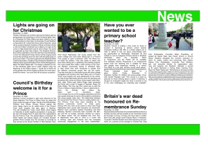
Then I re-formatted the text and images into a 2 column spread in order for it to look more like a magazine layout.

My aim was to keep the layout simple and less busy than my previous page-spread.

Below shows the changes I had made to my Contents and News Spread.

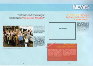
develop_contents

Develop_spread


After re-formatting the contents and news spread layout, going forward I decided to design the rest of the Newham Mag.

Looking back on my brief, it states that my aim is to keep the design consistent throughout the whole magazine and also simple to understand.

In order to give the Newham Mag a consistent identity, I decided to Colour Code each category  (Regulars – News, Mayors View, Newham In Focus and the Features etc).

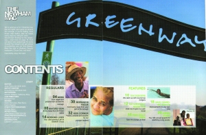
I also changed the Contents-Page once again in order to give each title/topic a different colour.

I done this because it may help the viewer identify each topic as they navigate themselves around the magazine.

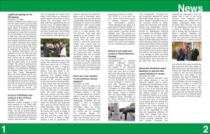
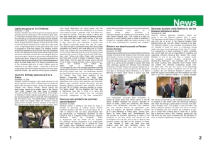
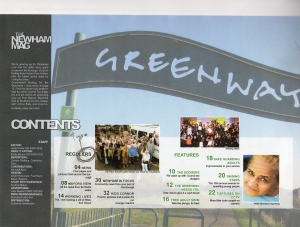
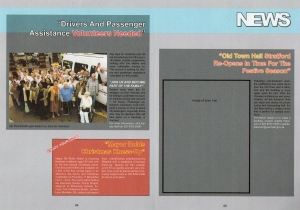
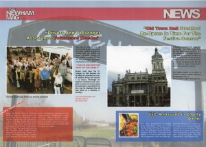
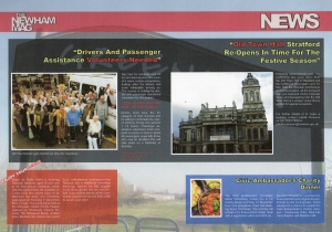
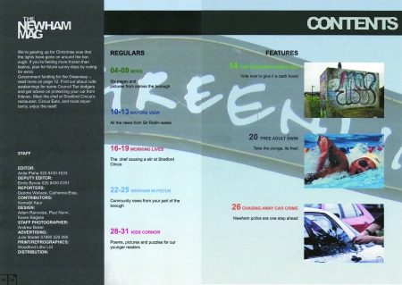
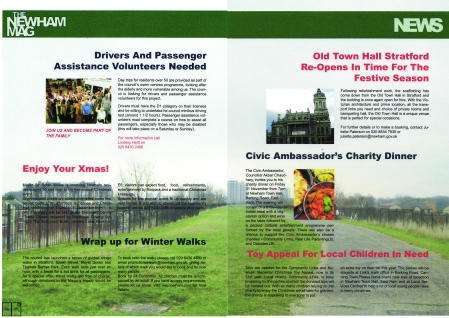
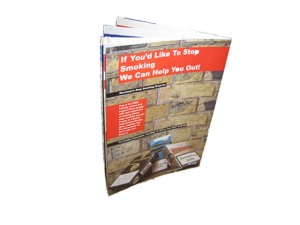
Here are some page layouts from my magazine and also a photograph of a printed version.

front

contents
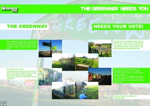
greenway2

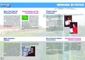
newham2

final_mag1back_mag

Evaluation

After researching on different layouts of magazines and attempting to produce a few layouts of my own, I started to understand why my tutor had pointed out that I had opened-up a ‘Can Of Worms’.

Re-creating the Newham Mag was harder than I had imagined and I realised that I didn’t have as much time as I would have hoped in order to produce the whole magazine.

It seemed that I spent most of the time researching and less time  designing different layouts.

After printing my final magazine and having my review, I wasn’t completely happy with the final outcome. 

The front cover looked quite messy and untidy, so I decided to change it in order to make it look more clear and pleasant to look at. I went for a more simple approach, after all simplicity was the main objective for the whole magazine.

For the front cover, the typefaces I used was Arial Regular for the words The and Mag

For the word Newham, I used Arial Black in order to emphasise its importance and make it stand out from the words The and Mag.

Below shows the changes I had made to the final outcome of The Newham Mag.

IMPROVED_TITLE


Exhibition/Gallery Visit

Posted in Exhibition/Gallery Visit on October 20, 2008 by shaun85


Exhibition visit – Jerwood Drawing Prize
On Tuesday 14th October I attended an exhibition in the Jerwood Space in Southwark. This exhibition was based on different techniques and mediums used such as line, shadow, thread, charcoal, coloured pencil on paper, ink and wax, different patterns and many more. The work of artists’ that were displayed involved Karen Russo, Susan Heap, Sarah Silverwood and more.

This exhibition, formerly The Cheltenham Open Drawing Competition, has been an annual open show since 1996 and became The Jerwood Drawing Prize in 2001. The aim of the exhibition is to promote and reward talent and excellence in contemporary drawing. The exhibition is currently open to entry by all artists resident or domiciled in the United Kingdom.

The Jerwood drawing Prize Exhibition was quite eye catching in some places. Noticing the different mediums, methods and purposes used was interesting to see. The way in which artists have different uses of line drawing techniques such as tracing, pattern, to create a 3 dimensional space and also using shadow was quite inspiring to acknowledge. Many artists involved the use of words in their work and one artist that especially caught my attention was Sarah Silverwood, who had the words “Fuck Christmas” in her work. As I glanced at her drawing, I could not help but look again to see if my eyes were telling the truth.
 

Exhibition visit – Rothko
On Thursday 16th October I attended an exhibition based on Mark Rothko’s work. Rothko’s work was titled The Late Series, which was displayed in The Tate Modern on the forth floor. Strategies of repetition and variation on a theme is what I had noticed as I entered in each of the 9 rooms.
Majority of his paintings are largely scaled and are similar to every one of his paintings. According to the evidence in the handbook given at the entrance of the exhibition, Rothko did not like to be watched while painting, not even by his studio assistants. He was not fond of people knowing his true techniques of how he accomplishes these largely scaled paintings. However, visual clues were left, in the sense that there were drip marks on his work. This shows that the process involved rotating his canvas’s in order to create these paintings. I noticed that there were photographs of his working studio space, but many questions about his technique could not be answered until recently.

Overall, I felt that Rothko’s work has a very deep meaning behind each and every one of his pieces. Knowing that he believed that having one painting was not enough, instead he decided to go back to the drawing board and accomplish many more in order to have a greater understanding of what he deeply wanted to accomplish. Every room I had entered, felt like a different atmosphere each time. However, I did feel a connection from each one of his pieces of work in each of the rooms. The lighting in each room was very dim and dull. The darkness within each of the rooms brought out a sense of insecurity and allowed me to experience this sense of personality been revealed in his work. The fact that Rothko did not like people to watch him accomplish his paintings, made me think that maybe he is trying to reveal this sense of insecurity on purpose.

Below, are a few images I managed to capture during my time in Rothko’s Exhibition. The two first images were done using Crayons on paper. The last two were done using Acrylic on canvas.

Crayon on Paper1Crayon on Paper2

Acrylic on Canvas1Acrylic on Canvas2

Below, are scanned images of a small hand book I had received as i entered Rothko’s Exhibition. It basically tells you about his work in each room and gives the audience more information about the man himself.

Room 1Room 3

Room 2Room 4 and 5

Mark Rothko in his WorkshopRoom 6

Room 7 and 8Room 9


Exhibition visit – J.Walter Thompson
For this weeks lesson, as a group we attended a few exhibitions that were occurring. We met at 10.45am on Knightsbridge Green outside J.Walter Thompson, 1 Knightsbridge Green, London SW1. 
Knightsbridge Green is on Brompton Road, between Harrods and Knightsbridge underground station, but on the other side of the road. We visited the ‘ Type Directors Club of New York’ exhibition. Every piece of work was displayed on a black sheet of card, as u can see the black boarder edges from the photographs. However, the edges were not even and straight, this probably proves that a spirit level was not used to help keep a straight line and even space. Overall, I enjoyed the exhibition and felt inspired by the different types and layouts I came across. Some pieces work had little detail but was very effective in sending a message to the viewers. Other pieces of work were very detailed and was just as effective as the posters that showed very little detail. It goes to show that quality overpowers quantity but with reason. I managed to take photographs of the different work displayed in the Exhibition, as we were given permission to. These photographs are situated below.
 

Exhibition visit – The Cold War Modern
 At 1.30pm on 22/10/08, we as a Graphic Design group went over to the V & A, which is located in South Kensington, not too far away from J.Walter Thompson. The first Exhibition was called The Cold War Modern. This exhibition tells the story of the Cold War, from national, international, social/political as well as cultural perspectives. The V&A space was used to showcase artistic and pop-culture works from both sides of the iron curtain, including the US, Russia, Czechoslovakia (as it then was), Poland, East and West Germany, China and Cuba. Highlights include a Sputnik, one of the first Russian artificial satellites to be launched into outer space; a Globe chair created in 1963 by the Finnish designer Eero Aarnio; and Soviet propaganda posters and photographs showing the first views of Earth from space. This exhibition was largely spaced out and allowed the viewers to experience the life back in the Cold War days.
 ‘This period from the end of the Second World War to the mid 1970s was a period of great political tension and exceptional creativity which touched all aspects of life, from everyday products to the highest arenas of human achievement in science and culture. Art and design were not peripheral symptoms of politics during the Cold War: they played a central role in representing and sometimes challenging the dominant political and social ideas of the age.’


Exhibition visit – Fashion vs Sport

Then at 3pm, after the Cold War Exhibition, we went over to visit the Fashion vs Sport exhibition, also in the V7A Museum. This Exhibition was located towards the left as you enter the Museum. The work of artists and designers was very moving. An interesting piece of work that caught my attention was based on ‘Engraveitti’, which is supposed to mean ‘Engrave’ and ‘Graffiti’ at the same time. This is a method the designer used on trainers in order to create a unique and fascinating concept for trainer designs. The talented and creative technique combined with the time commitment put into every trainer design is very impressive to acknowledge.  
A couple photographs that I managed to capture from the fashion exhibition are situated below (even though photography is prohibited). 
Wind Runner Jacket

Wind-Runner Nike Jacket

Geoff Hollister designed this jacket as an all-weather waterproof training garment. The upper half is made with a micro-thin coating of water repellent polyurethane and the lower half with vented insects for breathability. First worn by athletes at the American track and field trials in 1980, the jacket was soon appropriated by break-dancers because of the slippery nature of the material. Today, it is commonly worn as everyday wear.    

Adidas 35th Anniversary Special Edition

Adidas Superstar 3th Anniversary Special Edition Trainers

Adidas and Neighborhood 2005 


Exhibition Visit – Kishio Suga
 On the 29/10/08, I attended an Exhibition of Kishio Sugas’ work. This exhibition was based in Daiwa Foundation Japan House in 13/14 Cornwall Terrace. The nearest station is Baker Street and was about ten minutes walking distance from the station to the gallery. The artist himself, Kishio Suga, is one of the leading artists of Mono-ha (school of things), a movement that swept the Japanese art world from the end of the 1960s through the 1970s. Suga was born in 1944 in Morioka city, Japan. He graduated in painting from Tama Art University in 1968.
 Suga began using various methods to combine wood, stone, metal fragments and glass sheets, and deployed these combinations in exhibition spaces. We can perceive a piece of wood on many levels – from its surface to its cross section, from the whole to only a part, from its silhouette to its cellular makeup. In some sense, the wood doesn’t even exist until we perceive it. In a single stone pulses the logic of countless stones. A cosmos dwells within every piece of matter.
Suga draws out these hidden current and unites them, sometimes in harmony, sometimes in conflict, and opens upa light, free-flowing channel within the space. With a consistent focus on our surroundings, Suga brushes aside our search for symbolic meaning in the things we see and conjures up new, unfamiliar relationships between things. Via the paraphernalia of everyday, he raises the curtain on new world, and in liberating us from usual habits of thought, gives us a fresh set of eyes.

 The exhibition itself was interesting and the fact that there were two rooms where his work was displayed felt like two different atmospheres as I entered both the rooms. The Mews side exhibition room had a tall window, almost as tall as the ceiling from the ground. A lot of sunlight was coming in from that window and made it difficult for me to see Sugas’ work. However, next door in the Park side exhibition room, there were no distraction of sunlight appearing. If the curtains were drawn, then I would have felt a sense of consistency towards the exhibition. However, overall the exhibition was a new experience for me due to the fact that previous exhibitions have been based in artificial lighting not natural sunlight.  
 

Exhibition visit – Tayler Wessing ‘Photographic Portrait Size’

On Thursday 13th November, I attended an exhibition situated in the National Portrait Gallery. This exhibition was full of the work of gifted photographers who entered the Taylor Wessing Photographic Portrait Prize 2008. Some of the images shown were incredibly thought provoking, encouraging us to consider the story behind the picture. My overall impression was of the photographer’s immense talent, in both creativity and depth of vision. Overall, I really enjoyed the visit to the National Portrait Gallery and appreciated viewing the work of creative and talented individuals.


Prize Winners work, that were in the exhibition are situated below.

 1st_prize

Lotties Davies – First prize

Quints

From the Series Mermories and Nightmares

March 2008


2nd-prize

Hendrik Kerstens – Second Prize

Bag

November 2007


3rd-prize

Catherine Ballet – Third Prize

Ines Connected with Amina

From the Series Connected

June 2008


Problems

Posted in Problems on October 12, 2008 by shaun85

– Setting up my blog page wasn’t a problem but getting used to it was quite confusing at first. After a while I managed to find my way around wordpress.com including uploading images, videos and text.

–  The photographs I managed to upload were not in order, so therefore I had to click and drag every photo and place them in the correct order. I had to choose which photographs to delete carefully in order for the sequence of photographs to run smoothly once edited but I really found it challenging (747 photos all together, deleted 446 photos and ended up using 301 photos to keep within the time of 30 seconds). This consumed alot of time and I felt that this could have been avoided.

Getting Started

Posted in Getting Started on October 6, 2008 by shaun85

This is my first blog and so far i think im getting the hang of it. As soon as I just registered to Wordpress.com,I had no idea of what to do. However, after playing around and browsing through, its actually quite simple to use. My intentions is to gather up as much research and information i need in order to help me accomplish ideas of my own.

The first project giving to me was quite confusing in the beginning, but after taking down notes and discussing what exactly is suppose to be done, I was fine with the brief. The aim of this project is to create a Motion Picture/Animation/Video Clip using Stop-Motion based on the term Beauty. The following editing softwares allowed to be used are; One true Motion; One True Media; AniBoom; Ispot; MonkeyJam and Frame Thief. 

Questions I was asking myself today (06/10/08) in class:

“How far do people go in order to look beautiful?”

“Why do we Smile?”

“Everything has beauty, but not everybody sees it…Why?”

Using One True Media, I decided to put together a short stop-motion clip of myself sitting in one place doing random things. The photographs were captured on my web cam of my laptop. I found that taking the photographs was much easier than putting it all together. I tried uploading other online softwares such as Aniboom and Frame Thief but was unable to do so.

My 1st attempt on stop motion.